remaking cinni's dream home~
Nov. 30th, 2022 05:42 pmhi dreamwidth, i've been redoing my site on another host and it has been fun because starting over from scratch is a much easier experience haha.
i am still deciding on a layout and how to reorganize everything.. the site currently is divided between "me" and "you" content, but to be honest a lot of pages are hard to categorize this way. dolls ive made would go under "me", but doll bases ive made for others to use would go under "you", but i don't want to separate content into two pages either. I've decided on something more like...
- profile: for personal pages like an about, diary, or photos page.
- gallery: for anything ive made like art, pixels, music, games.
- library: for showcasing text/manga, possibly recipes or essays in the future.
- shrines: where i proudly shout my love for things
- mods: the mod shop, things ive made to customize your program/site/desktop/game/whatever.
- collection: for graphics, fonts, midi files, etc, ive collected and not made by me (but can have things ive made lol)
- fun: for silly fun pages like dollmakers and url/image generators etc.
- directory: for links, sitemaps, or a list of links re: a specific topic. just lots of links
i think this breaks up most of my content in these categories and hopefully make navigation/organization a bit easier.
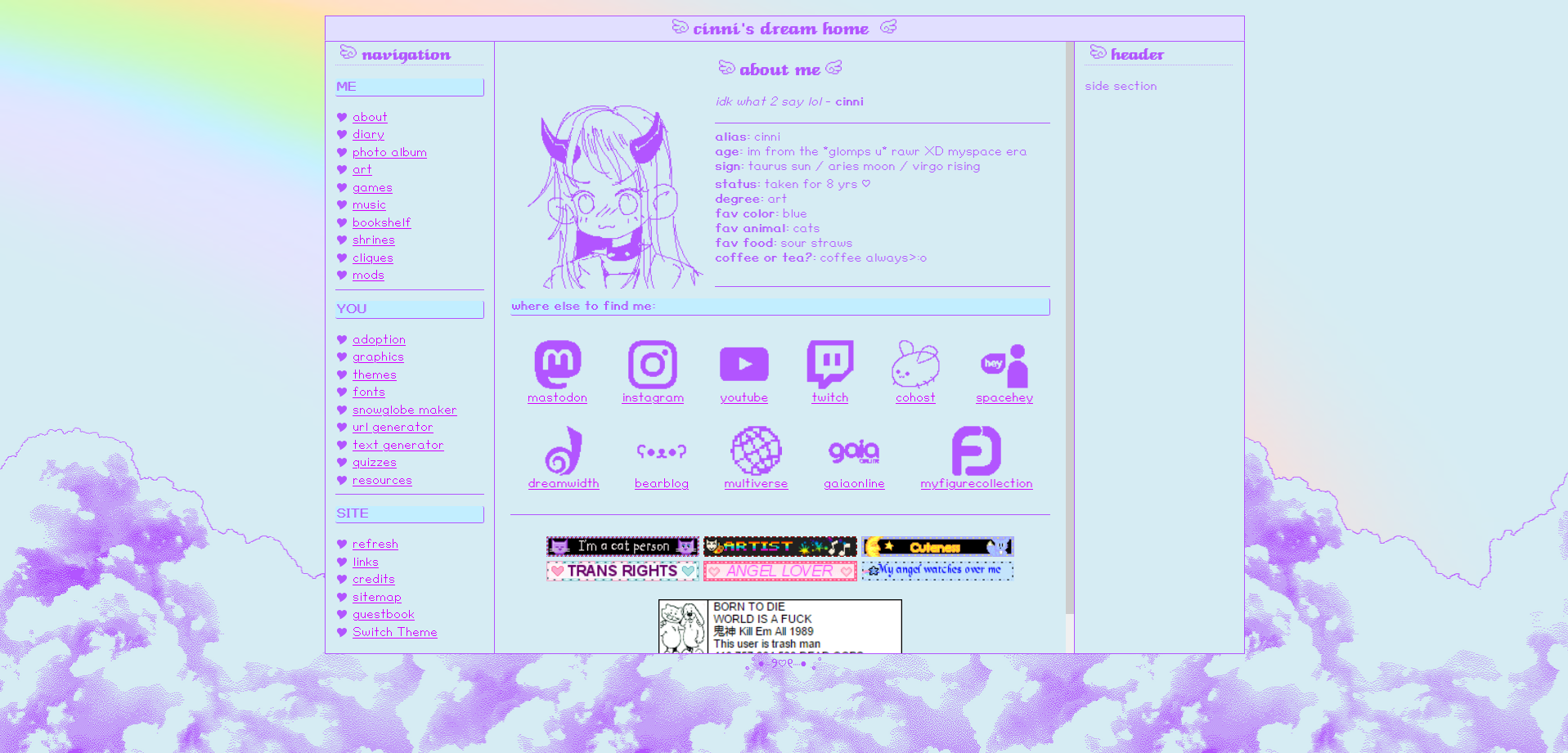
this was one of the first iterations. i had imagined i'd eventually add more visual elements to the layout, but i wanted to keep it simple for now. i made a bunch of these purple icons which work well for both light/dark modes ^_^

I still kept an iframe-type layout here, but making it work for mobile is tricky.. plus, as you can see, having every page listed on the navigation is a lot, specially when the site grows and i add more pages. which is why i wanted to condense the navigation a bit. :p

..and here's what i'm currently working on. i'm not 100% sure i want to keep that background, but it's kinda refreshing to have a very bare layout. it feels light and dainty, like it's barely there.. lol. i think its kinda cute in its own way, even if very different compared to what my site is now. i've been cleaning up each page's code because almost all of them used <divs> or <spans> instead of <h1>s and <h2>s and looots of tables where a flex box couldve been used. its also uhmm iframe free and uses javascript to generate the nav/headers. it's much better on mobile now tho :V

dark mode is just cozy ykno.. ive been in a big ascii art mood lately, like look at this bar's website and tell me you don't love it too. >:O
anywho, i still have some more work to do cleaning up all the pages. part of me doesn't want to remove my current layout, but at the same time it does need some cleaning up..gah
i am still deciding on a layout and how to reorganize everything.. the site currently is divided between "me" and "you" content, but to be honest a lot of pages are hard to categorize this way. dolls ive made would go under "me", but doll bases ive made for others to use would go under "you", but i don't want to separate content into two pages either. I've decided on something more like...
- profile: for personal pages like an about, diary, or photos page.
- gallery: for anything ive made like art, pixels, music, games.
- library: for showcasing text/manga, possibly recipes or essays in the future.
- shrines: where i proudly shout my love for things
- mods: the mod shop, things ive made to customize your program/site/desktop/game/whatever.
- collection: for graphics, fonts, midi files, etc, ive collected and not made by me (but can have things ive made lol)
- fun: for silly fun pages like dollmakers and url/image generators etc.
- directory: for links, sitemaps, or a list of links re: a specific topic. just lots of links
i think this breaks up most of my content in these categories and hopefully make navigation/organization a bit easier.
this was one of the first iterations. i had imagined i'd eventually add more visual elements to the layout, but i wanted to keep it simple for now. i made a bunch of these purple icons which work well for both light/dark modes ^_^
I still kept an iframe-type layout here, but making it work for mobile is tricky.. plus, as you can see, having every page listed on the navigation is a lot, specially when the site grows and i add more pages. which is why i wanted to condense the navigation a bit. :p
..and here's what i'm currently working on. i'm not 100% sure i want to keep that background, but it's kinda refreshing to have a very bare layout. it feels light and dainty, like it's barely there.. lol. i think its kinda cute in its own way, even if very different compared to what my site is now. i've been cleaning up each page's code because almost all of them used <divs> or <spans> instead of <h1>s and <h2>s and looots of tables where a flex box couldve been used. its also uhmm iframe free and uses javascript to generate the nav/headers. it's much better on mobile now tho :V
dark mode is just cozy ykno.. ive been in a big ascii art mood lately, like look at this bar's website and tell me you don't love it too. >:O
anywho, i still have some more work to do cleaning up all the pages. part of me doesn't want to remove my current layout, but at the same time it does need some cleaning up..gah